
The Challenge
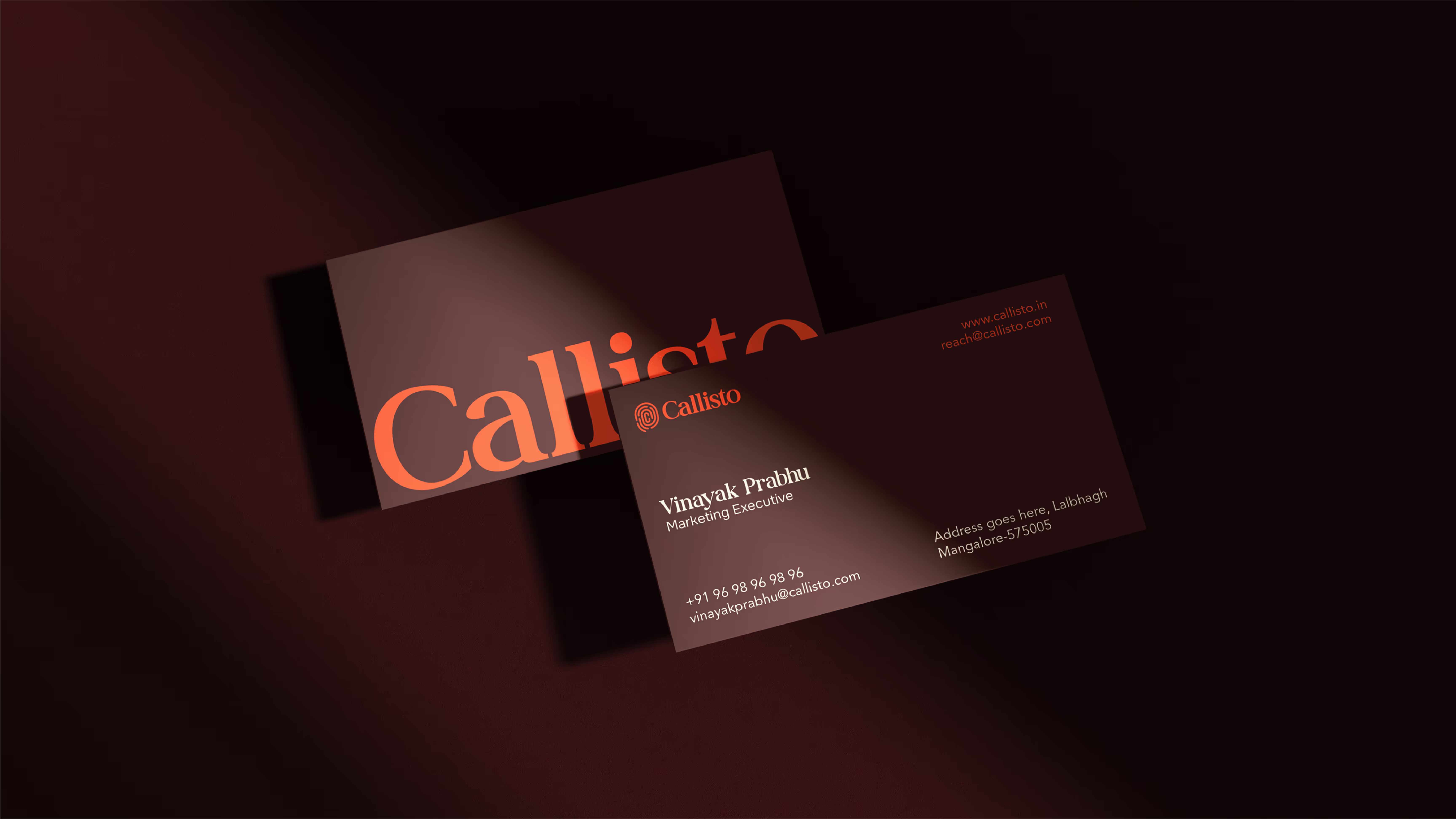
Creating an identifying mark that was instantly recognisable and meaningful required restraint and precision. The identity needed to remain simple enough to scale seamlessly across applications, while still communicating security, sophistication, and clarity. It had to avoid unnecessary complexity, ensuring ease of reproduction across digital, print, and environmental touchpoints, while retaining a distinctive and premium presence.
"We were looking for something meaningful and secure in character, but never complicated."
Our Solution
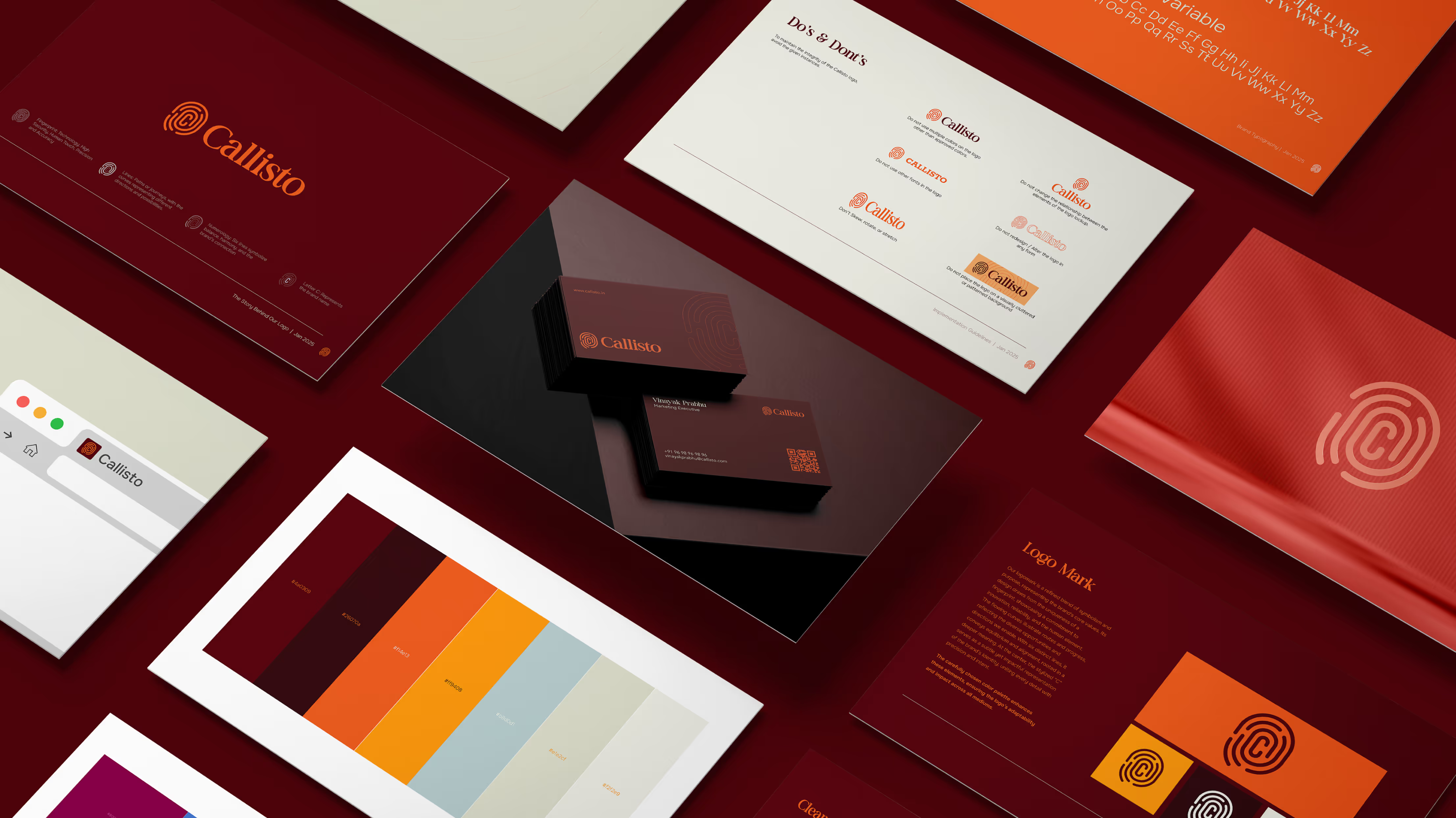
A clear hierarchy was established within the identity system to ensure both flexibility and clarity. A scalable secondary icon mark was developed for compact and versatile applications, while a refined and more legible wordmark was crafted to confidently stand alone as the primary brand identifier. Contemporary typography and a bold, technology-driven colour palette reinforce a sleek, modern presence. Together, these elements form an adaptable and future-ready system that communicates precision, innovation, and premium sophistication.
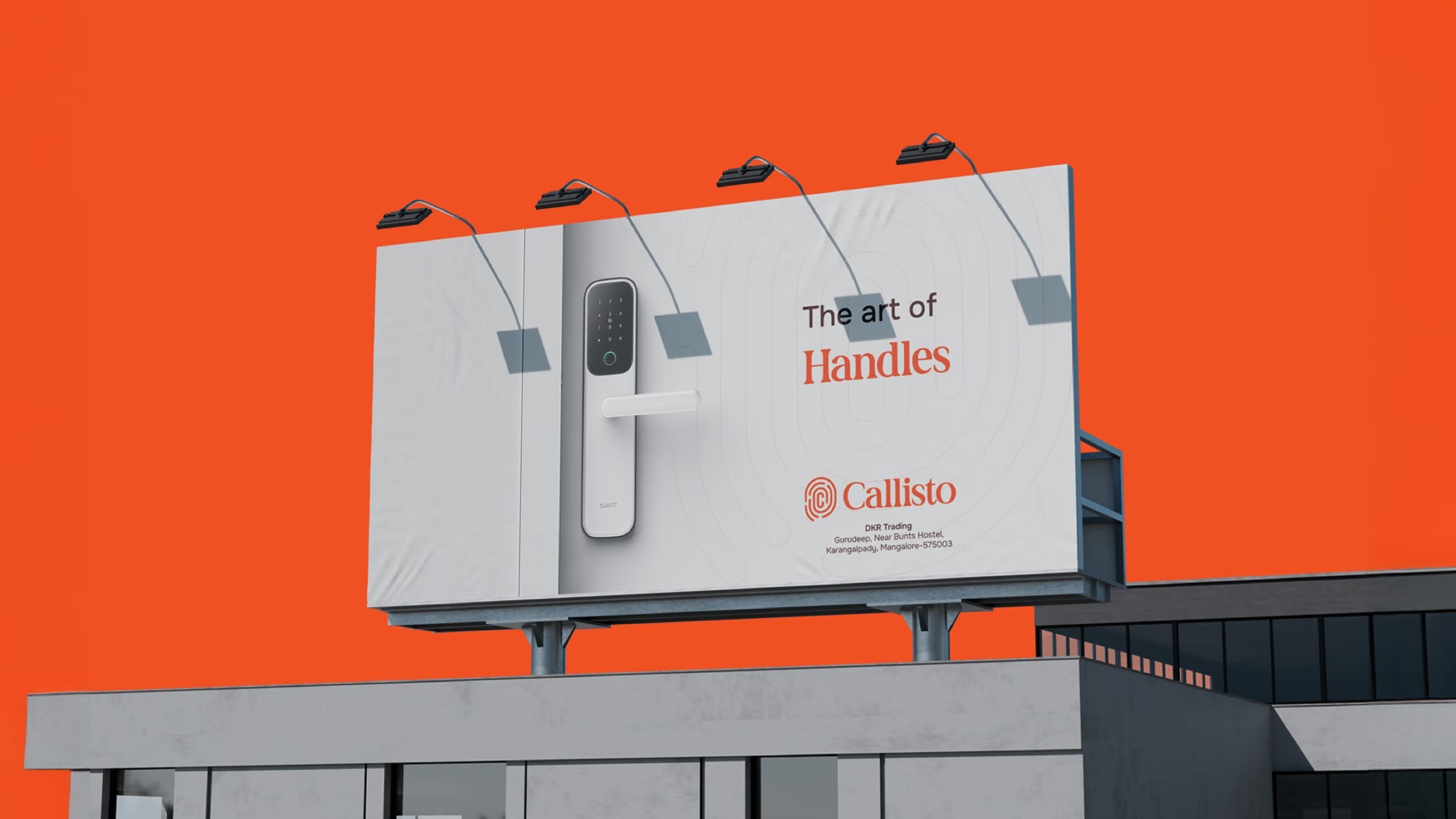
A sleek and scalable identity system, inspired by security and technology, built for modern luxury precision.
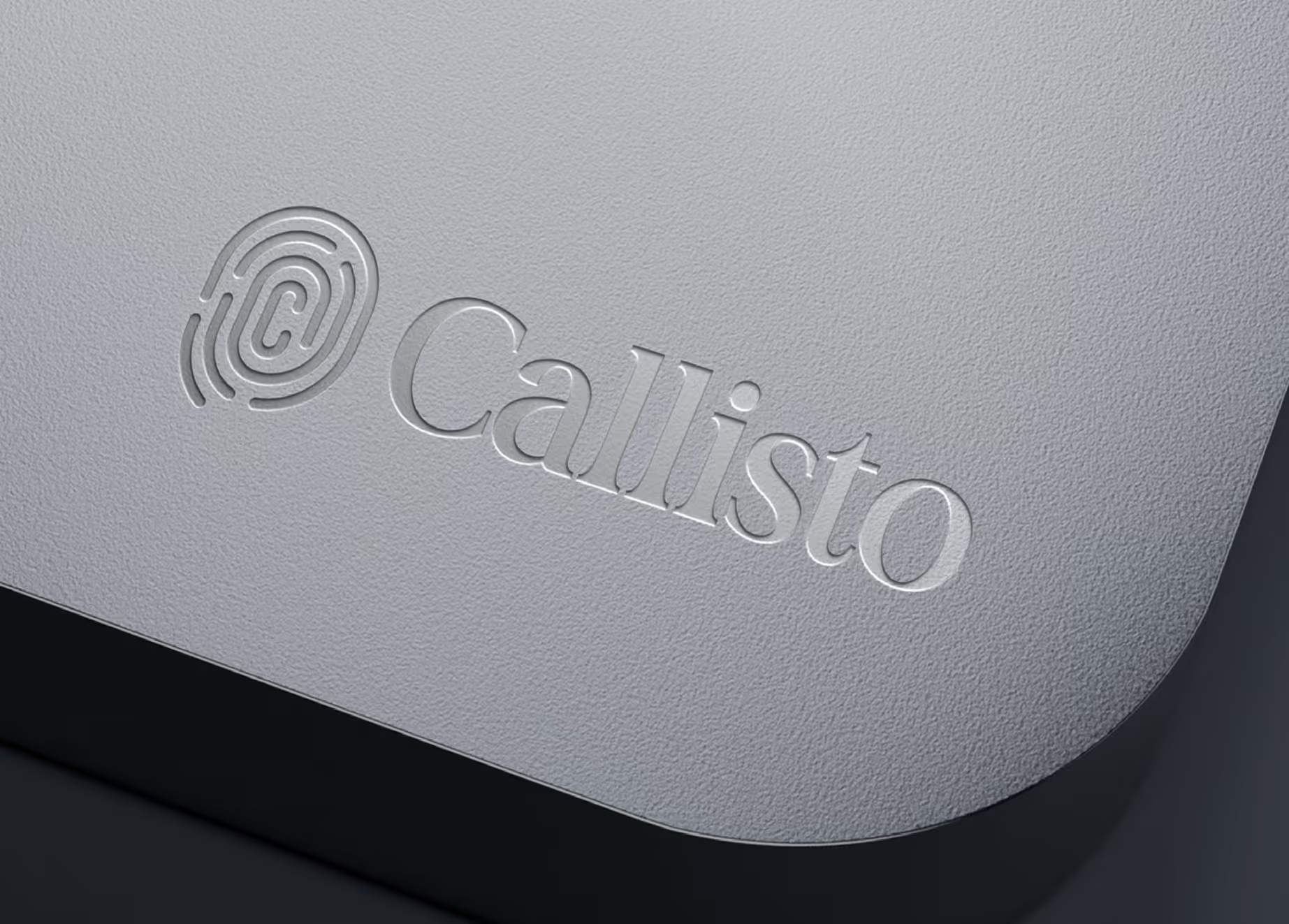
Inspiration for the logo stemmed from the idea of security at its most intuitive point of contact. Doors represent protection, privacy, and controlled access, while fingerprint detection symbolises advanced, personalised security. These concepts were abstracted into a refined mark that merges structure with fluidity, echoing both the solidity of a secure entry point and the organic uniqueness of a fingerprint. The flowing lines suggest controlled pathways and precision, while the central form anchors the symbol in clarity and strength. This fusion of physical security and modern technology shaped an identity that feels both innovative and dependable.
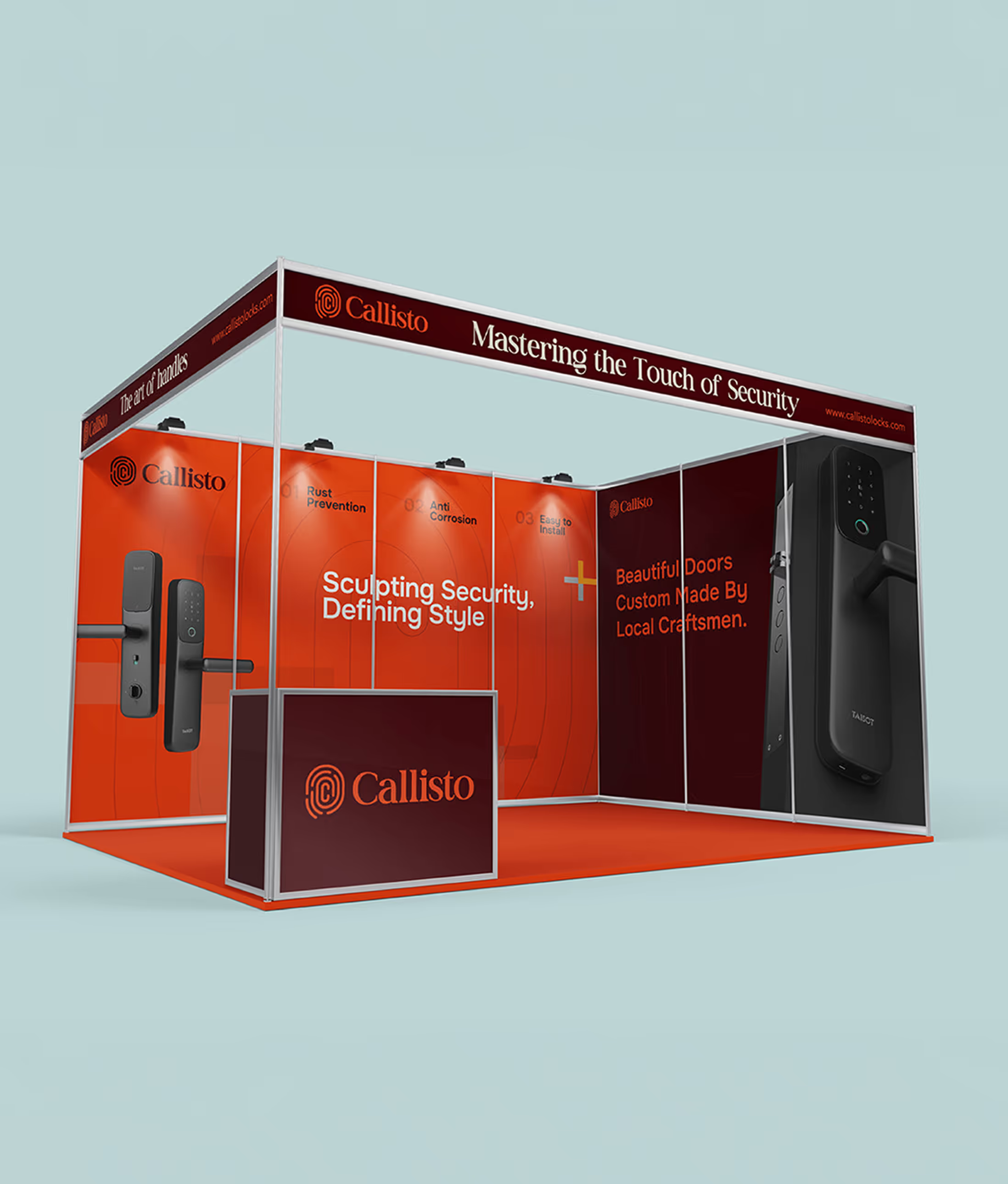
Project Deliverables
- Brand Strategy & Positioning
Our Learning
Working on Callisto reinforced the importance of designing an identity that communicates clearly at every scale. The mark had to remain self-explanatory and recognisable even in its smallest applications, without losing distinction or being confused with another brand. The process highlighted how simplicity demands precision, and how thoughtful detailing ensures that clarity, uniqueness, and scalability coexist within a single cohesive system.
Measurable
Business Impact
Improvement in Logo Recall at Small Sizes
Refined hierarchy and a clearer wordmark strengthened recognisability across digital icons, signage, and compact applications.
Increase in Brand Consistency Across Touchpoints
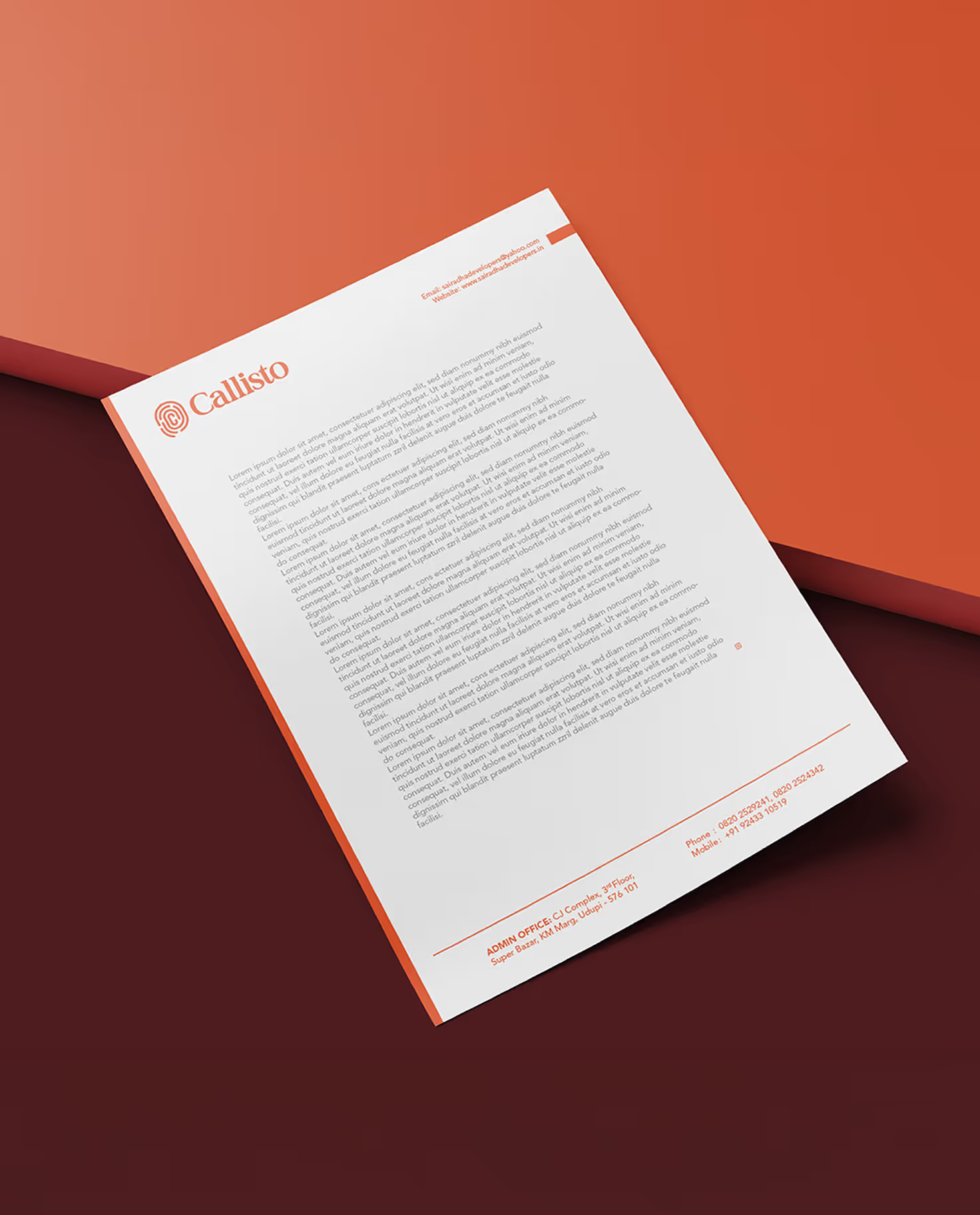
A structured identity system streamlined implementation across print, digital, and environmental branding.