
The Challenge
For over 90 years, JK Group had built a strong reputation through its diverse ventures, guided by trust, integrity, and long-standing relationships. However, despite its legacy and scale, the group had never formally positioned itself as a unified brand in the market. With multiple dependent companies operating under its umbrella, there was a growing need to establish a clear brand hierarchy, define the relationship between the parent and its sub-brands, and bring strategic structure to an enterprise that had evolved organically over decades.
"We’ve always built with purpose. It was time for our identity to show the same clarity and confidence that define our work."
Our Solution
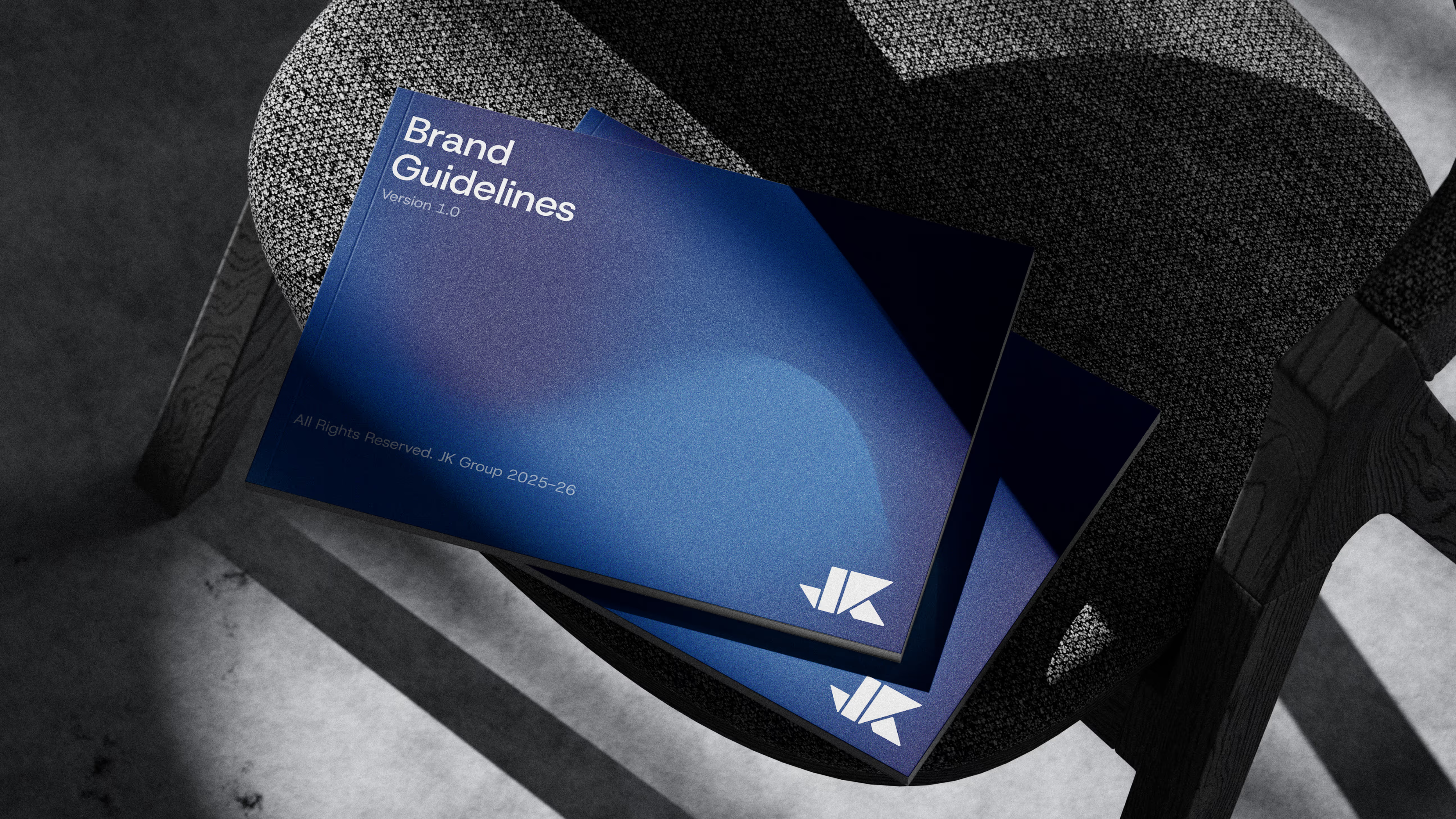
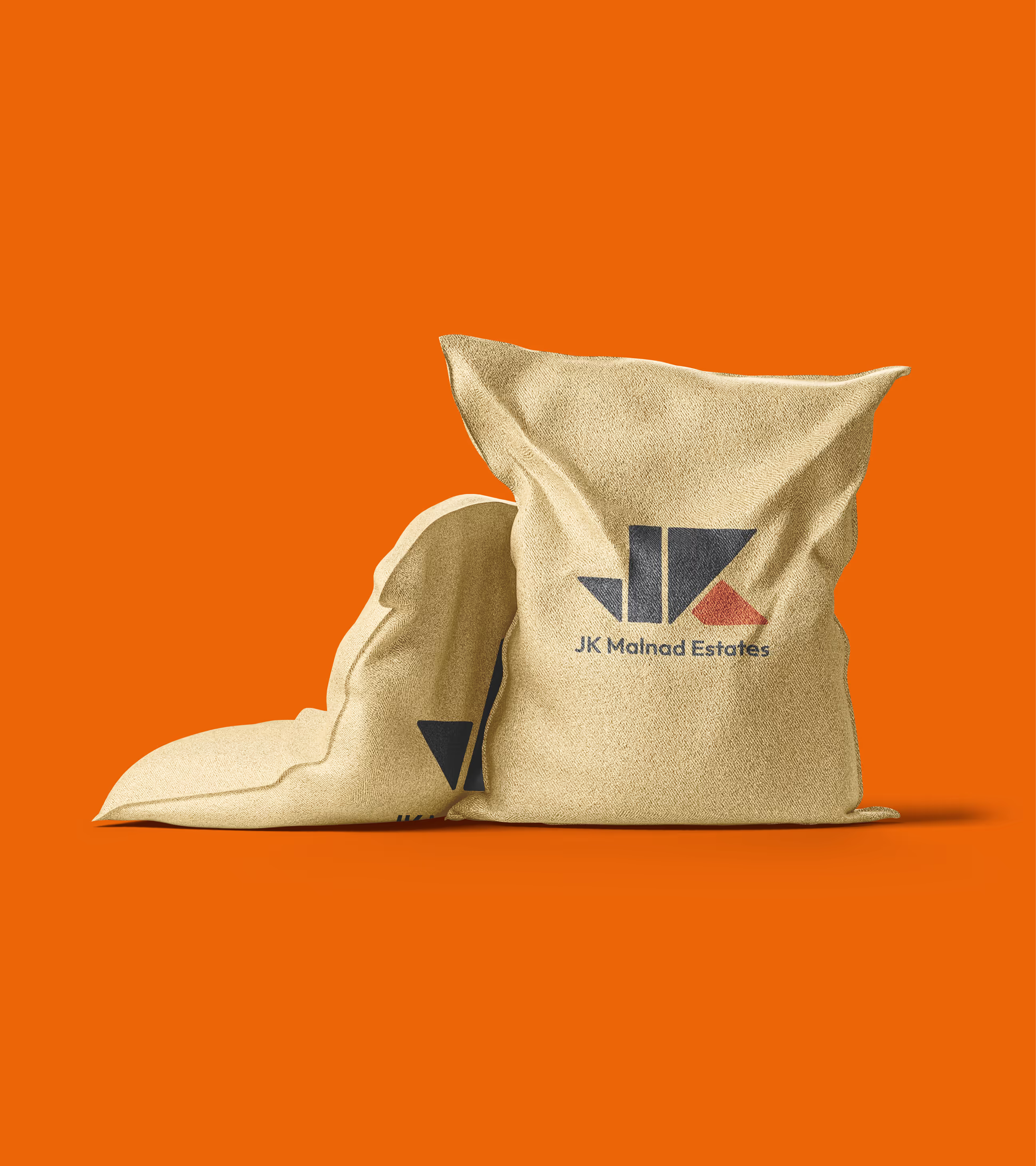
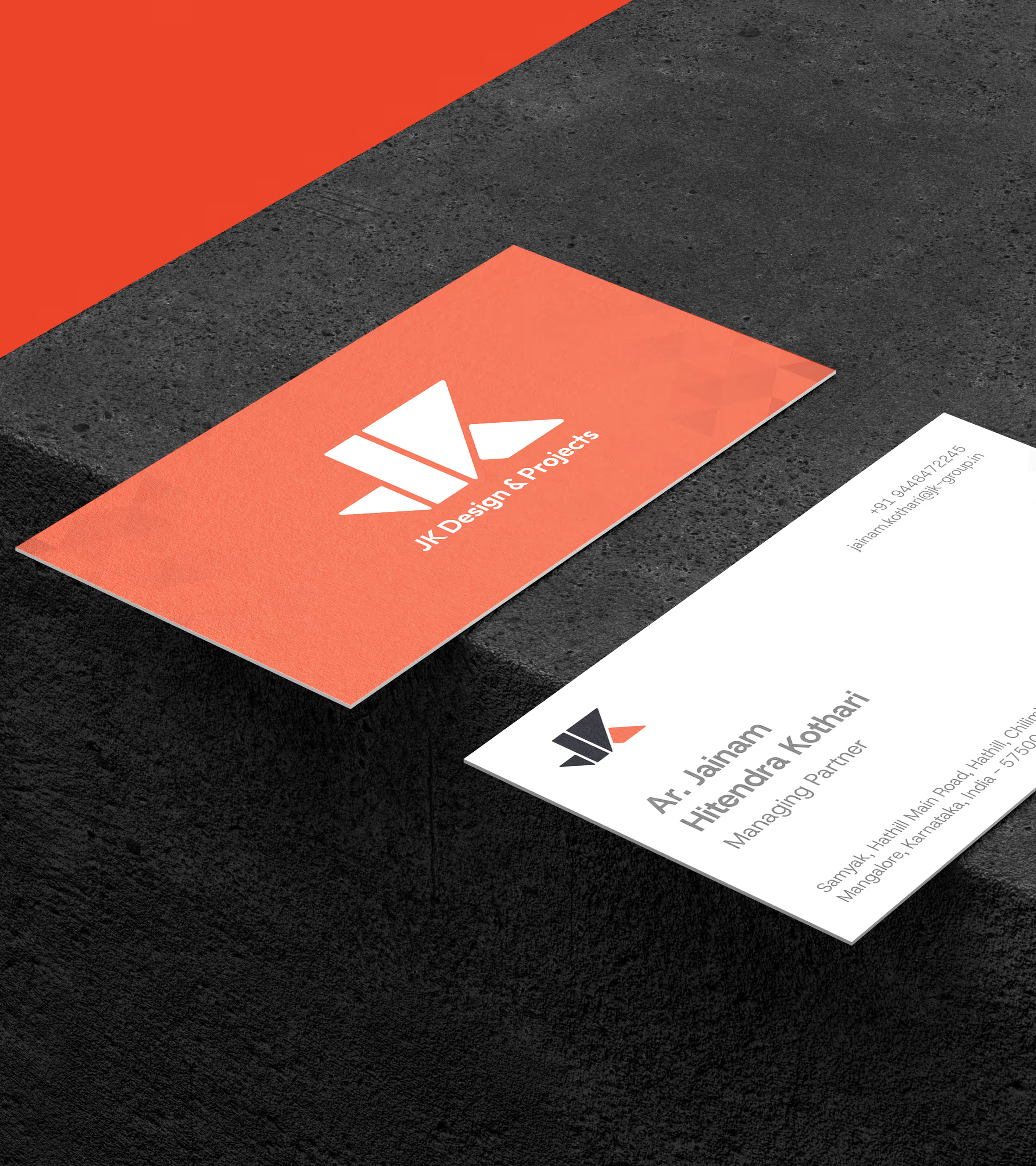
A comprehensive brand architecture was established to formalise the relationship between the parent entity and its dependent companies. Through a clearly defined hierarchy, structured colour logic, and a unified geometric identity system, decades of organic growth were consolidated into a coherent and scalable framework. The outcome was a disciplined yet adaptable brand ecosystem that preserved a 90-year legacy while strengthening clarity, distinction, and long-term strategic positioning.
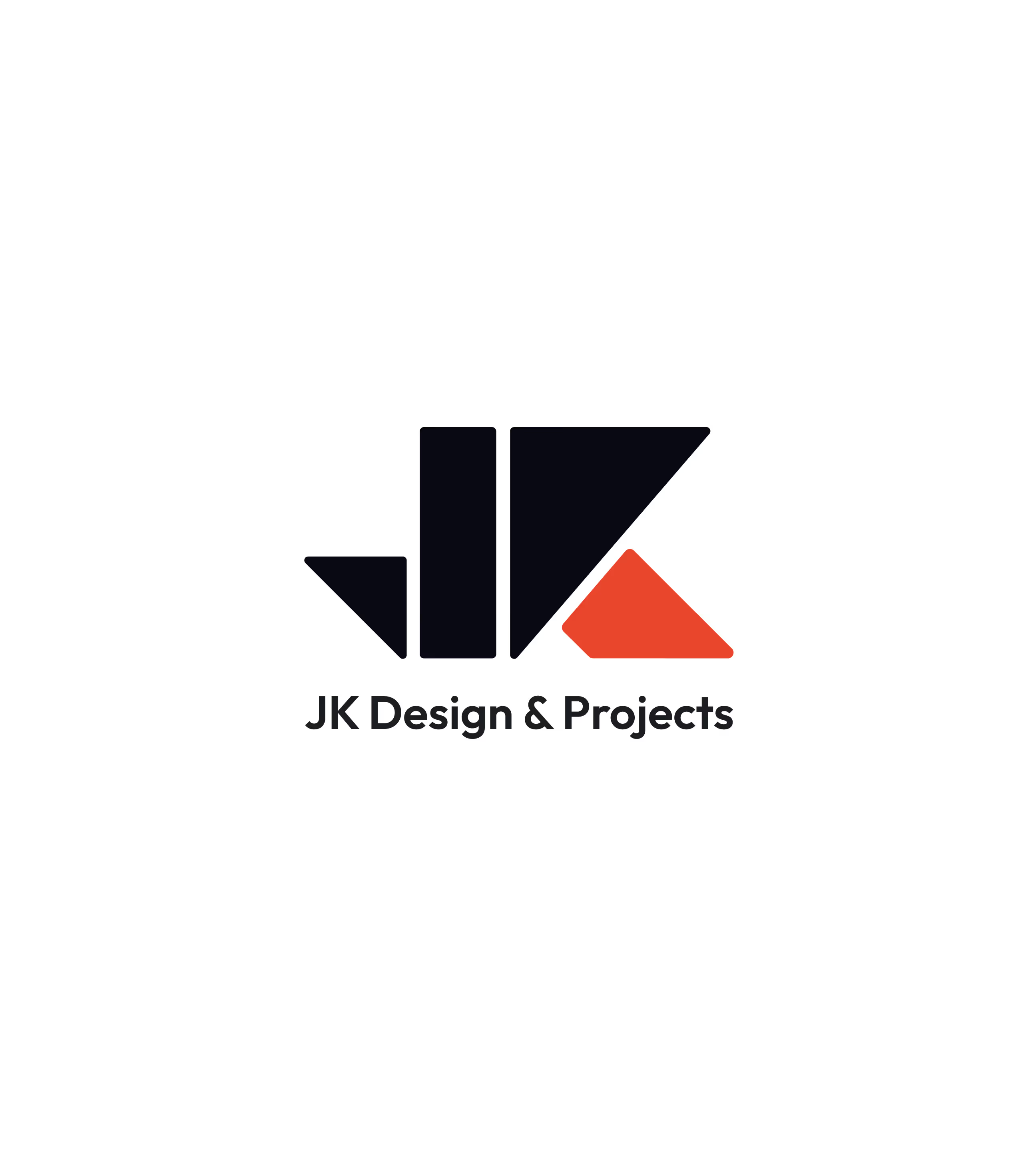
A structured and minimal mark, defined by symmetry and form, expressing stability, progress, and authority.
The brandmark is constructed through a precise interplay of triangles and rectangles, reflecting balance, structure, and forward movement. The corporate blue gradient establishes depth, trust, and stability, symbolising the strength of the parent entity. Distinct sub-brand colours are strategically applied to designated elements within the mark, reinforcing individuality while maintaining a cohesive visual system. This structured colour logic ensures unity across the group while allowing each vertical to express its own focus and identity within a disciplined framework.
Project Deliverables
- Brand Strategy & Positioning
- Logo Design & Brand Identity
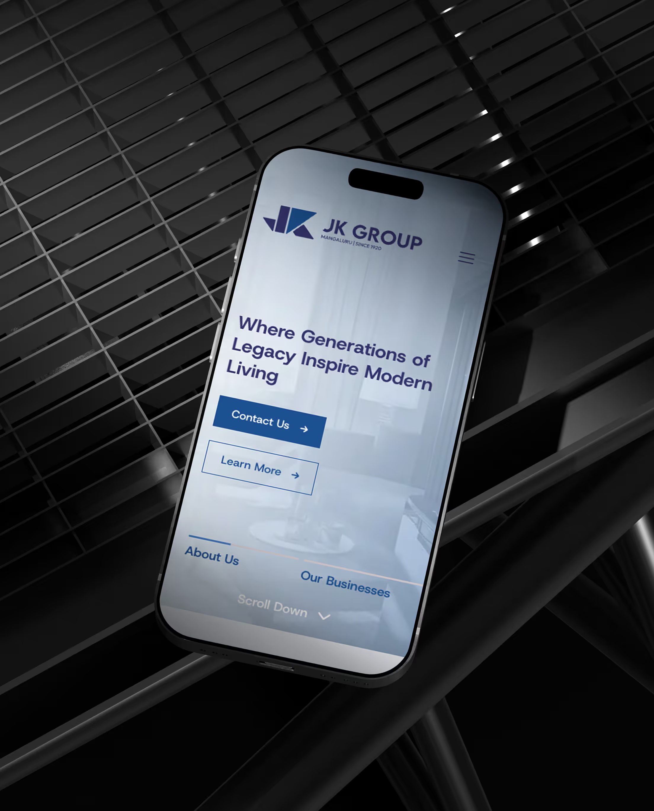
- Custom Web Design & Development
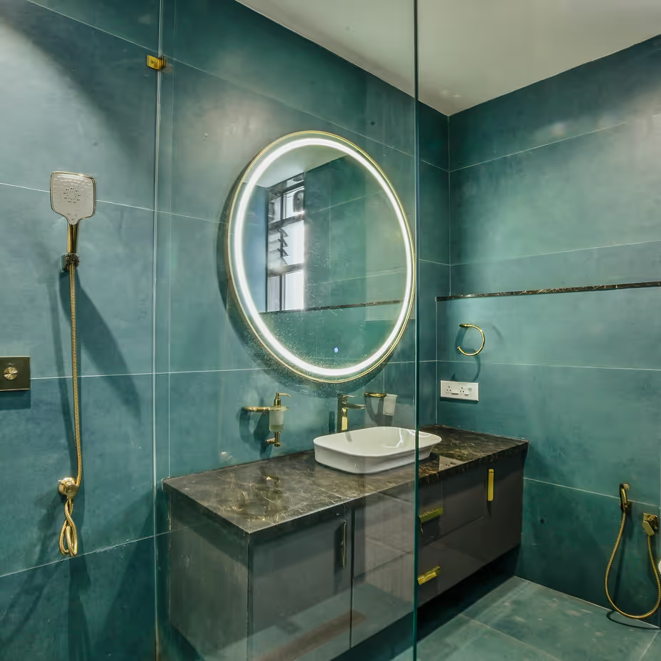
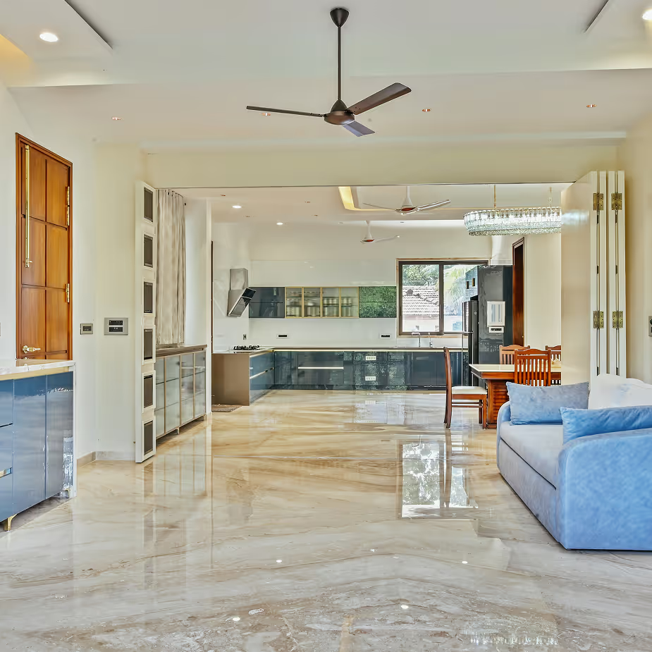
- Architectural Photography
- Walkthrough Video Production
Our Learning
Working on JK Group reinforced the importance of bringing structure to legacy without disrupting its essence. The project highlighted how decades of organic growth can create strength, but also complexity that requires thoughtful alignment. Formalising hierarchy, defining clear relationships between parent and sub-brands, and building a scalable system taught us that clarity is not about reinvention, but about revealing the strength that already exists. True brand architecture respects history while preparing it for the future.


Measurable
Business Impact
Increase in Brand Recall
A unified visual language and defined hierarchy strengthened recognition of the parent brand across all verticals, improving overall brand equity.
Cross-Brand Clarity Improved
Clear brand architecture reduced confusion between entities, establishing stronger distinction while maintaining cohesion within the group.
Increase in Enquiry Conversions
A more authoritative and structured brand presence enhanced credibility, leading to stronger inbound engagement and higher conversion intent.
Faster Marketing Rollout
Standardised design systems streamlined asset creation and approvals, enabling quicker execution across divisions.