
The Challenge
Mukund Realty had already built strong goodwill in the market through years of consistent delivery and trusted relationships. The challenge was not to reinvent the brand, but to articulate it with greater clarity and intention. The identity needed to reflect the integrity, precision, and purpose that had always defined its practice, while evolving into a visual language that felt contemporary and aligned with a growing luxury real estate audience. It had to honour its credibility while amplifying it through a more cohesive and confident expression.
"We weren’t changing who we are. We were finally giving our brand the meaning it always deserved."
Our Solution
A refreshed visual identity and communication strategy were developed. We focused on the feeling of home and community rather than just bricks and mortar. The new branding introduced a dynamic color palette and clean typography, establishing a contemporary yet trustworthy image. The website became a central hub for their audience, offering seamless property exploration and clear lead generation funnels.
A cohesive and elevated brand language, translating earned goodwill into contemporary clarity.
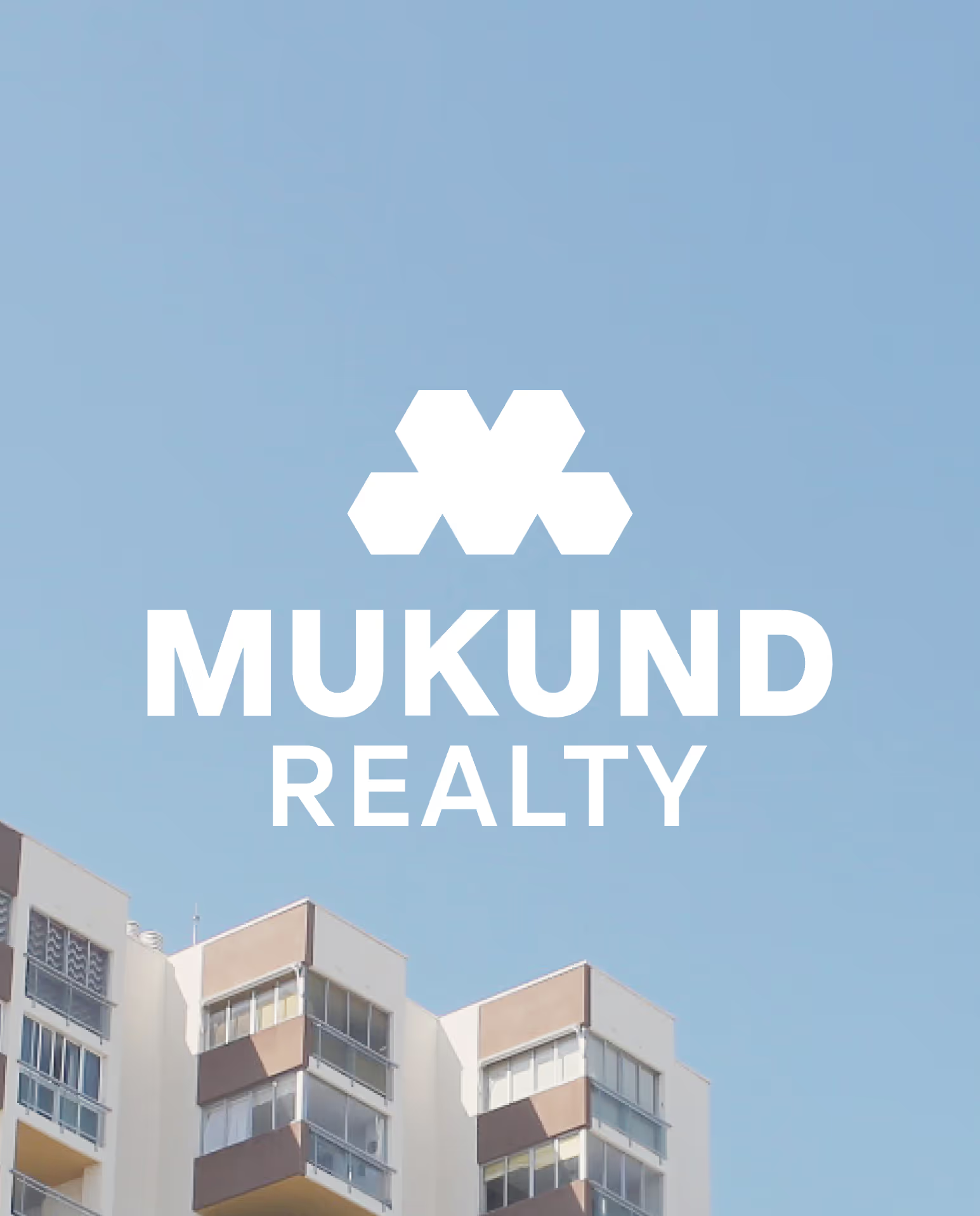
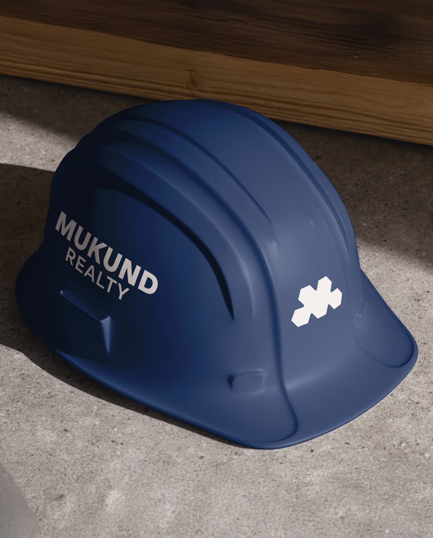
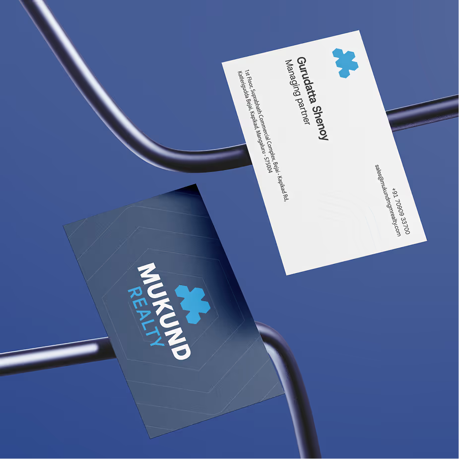
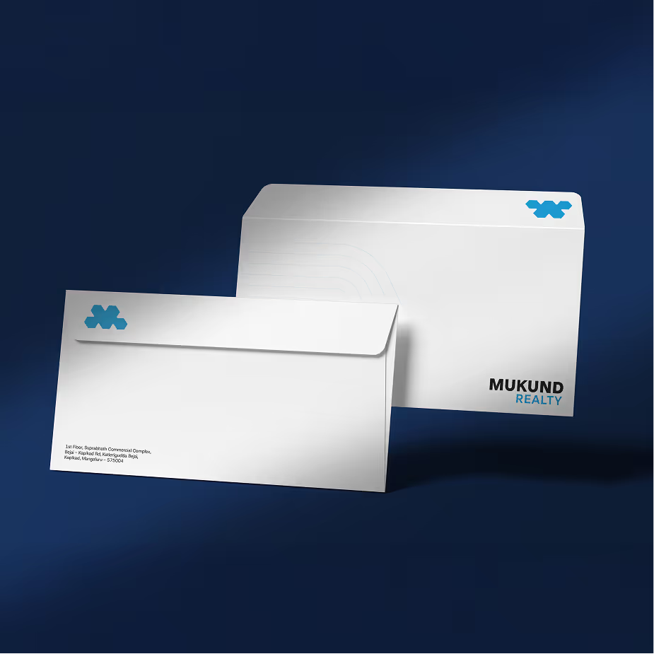
The existing goodwill Mukund Realty had earned over the years became the foundation for a more intentional visual language. Core values such as trust, precision, and dependability were translated into a disciplined colour palette, refined typography, and balanced geometric forms. The primary blues reinforced stability and professionalism, while complementary tones added depth and modernity without overwhelming the brand’s grounded character. These elements came together to form a cohesive identity system that felt familiar yet elevated. By formalising what the brand had always stood for into clear palettes, shapes, and guidelines, the visual expression now mirrors the integrity and consistency that define Mukund Realty in practice.
Project Deliverables
- Brand Strategy & Positioning
- Custom Web Design & Development
- Walkthrough Video Production
Our Learning
Working with Mukund Realty reinforced the value of recognising the strength within a living brand. Over the years, the brand had evolved organically, without intentionally defining a formal visual language, yet its values and credibility were deeply embedded in practice. The learning was that transformation does not always require reinvention. Through measured refinements and disciplined tweaks, a cohesive brand system could be cultivated from what already existed. The process highlighted how clarity often comes from alignment, not overhaul, and how even subtle adjustments can create a unified language that feels both authentic and future-ready.
Measurable
Business Impact
Increase in Founder Enquiries
A unified visual language and defined hierarchy strengthened recognition of the parent brand across all verticals, improving overall brand equity.
Increase in Repeat Website Visits
A more contemporary and premium digital presence strengthened ongoing audience interest.
Improvement in Overall Visual Brand Consistency
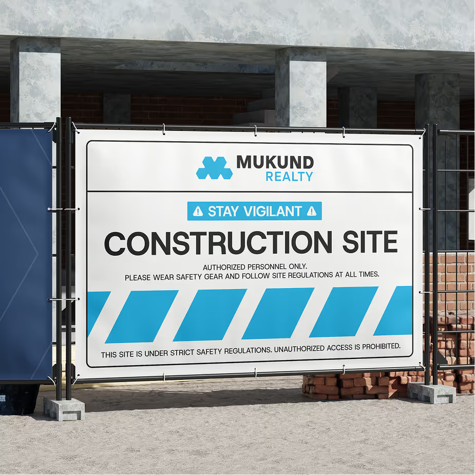
Structured brand guidelines reduced inconsistencies across digital, print, and on-site communication.
Increase in Average Session Duration
A refined user experience and clearer project storytelling encouraged deeper engagement across the website.