
The Challenge
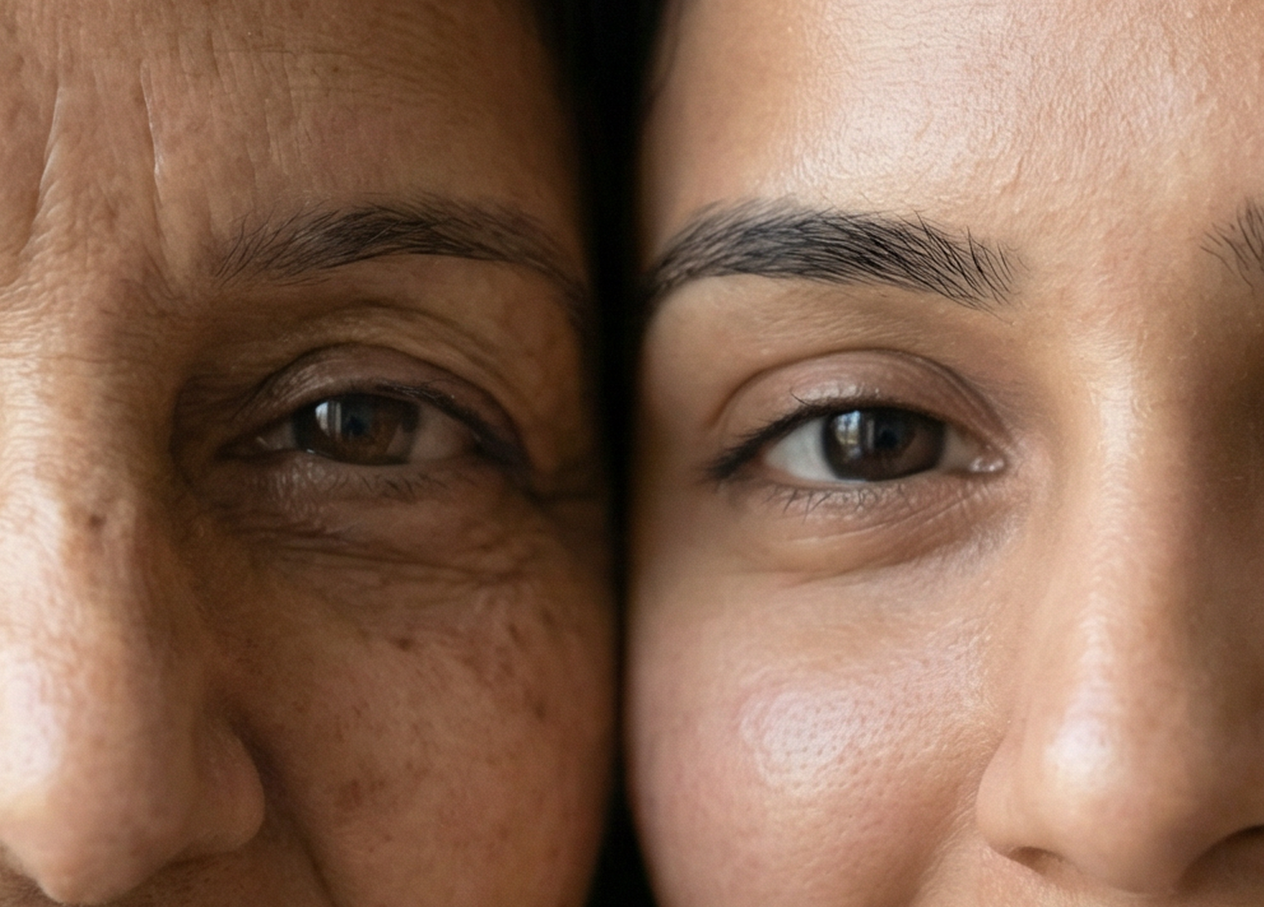
Portraying a deeply personal and often taboo subject in India required dignity and empathy, while preserving medical credibility and expertise. The brand needed to communicate women’s health in a way that felt human, reassuring, and respectful, without diluting the authority and trust expected from a healthcare provider.

"We needed a voice that could make difficult conversations feel safe, yet medically sound and trustworthy."
Our Solution
The approach leaned more heavily into the human side of the conversation, normalising women’s health without shame or discomfort. Language and visuals were shaped to feel warm, reassuring, and emotionally safe, encouraging women to seek information with confidence rather than hesitation. At the same time, medical expertise remained clear and present, ensuring the brand felt trustworthy without becoming overly clinical or harsh.
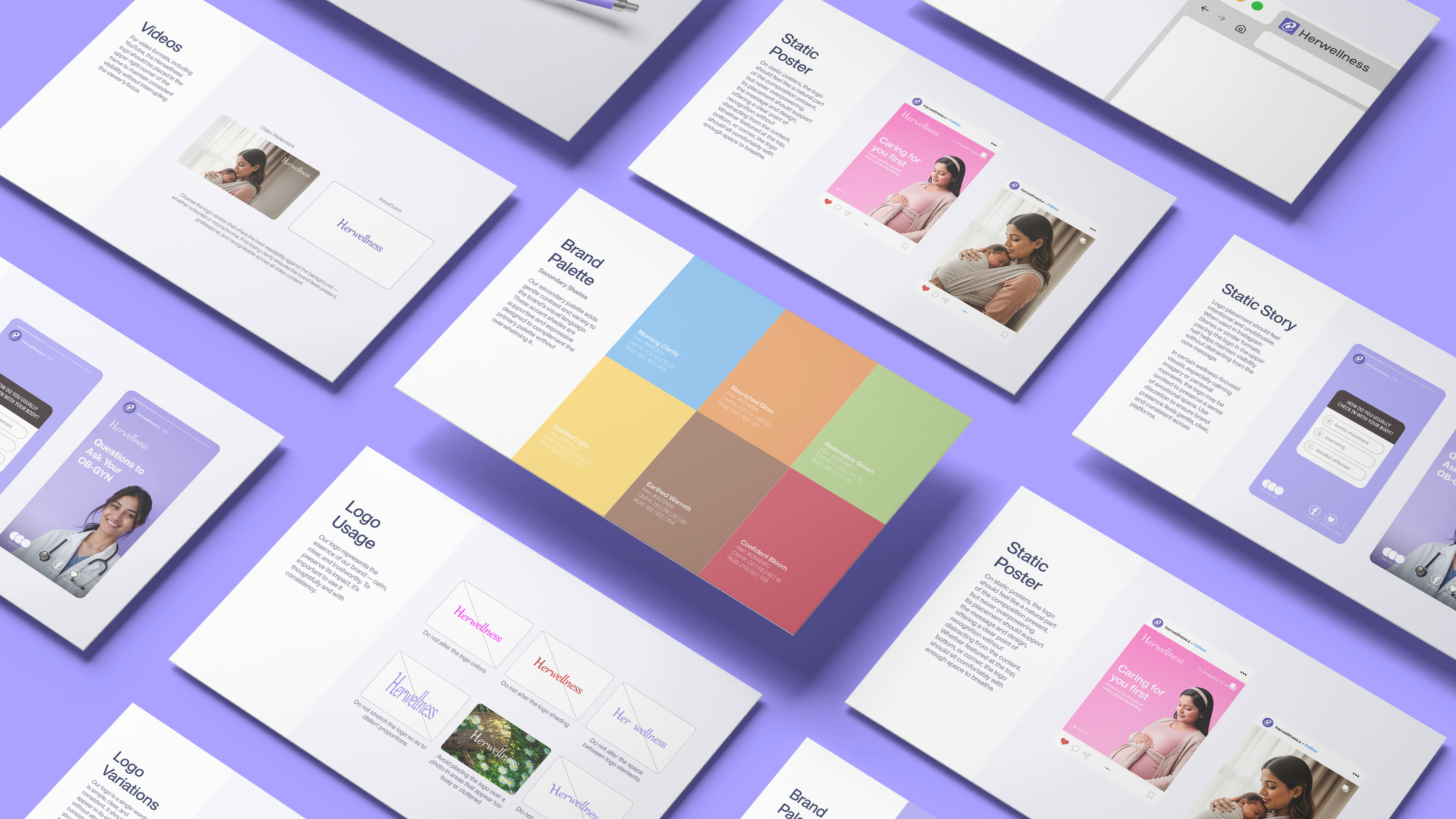
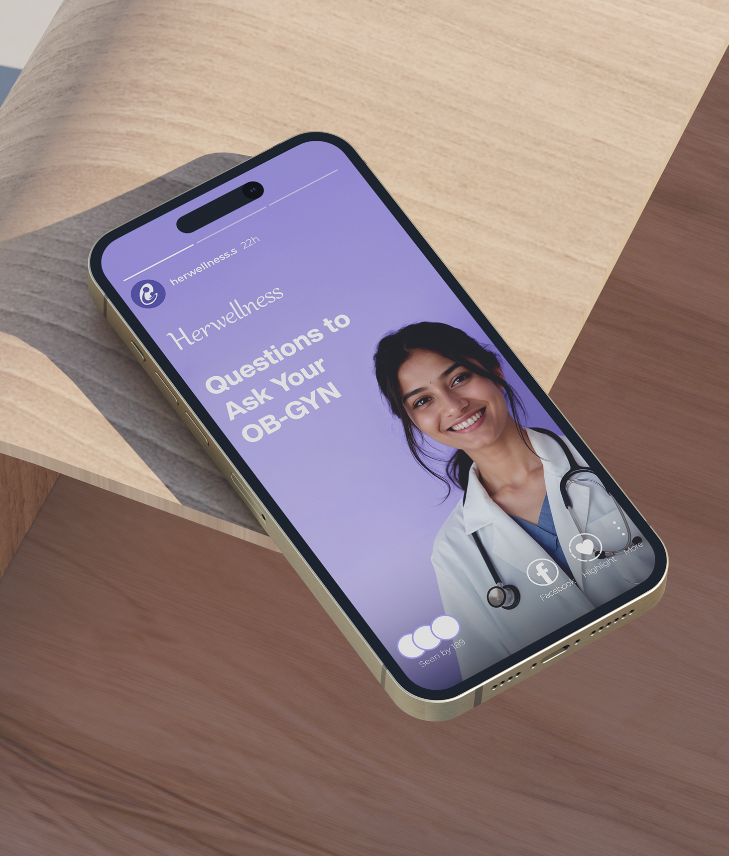
A gentle yet composed identity, designed with simplicity and intention to reflect warmth, reassurance, & professionalism.
The Logo is expressed as a soft, minimal wordmark designed to convey calm, care, and clarity. Its balanced letterforms and generous spacing create a sense of ease and quiet strength, reflecting the brand’s commitment to thoughtful and trusted wellbeing. The gentle primary palette reinforces warmth and reassurance, while secondary tones provide subtle flexibility across touchpoints. Together, the simplicity of form and disciplined colour usage create a cohesive identity system that feels personal yet professional, supporting open and dignified conversations around women’s health.
Project Deliverables
- Brand Strategy & Positioning
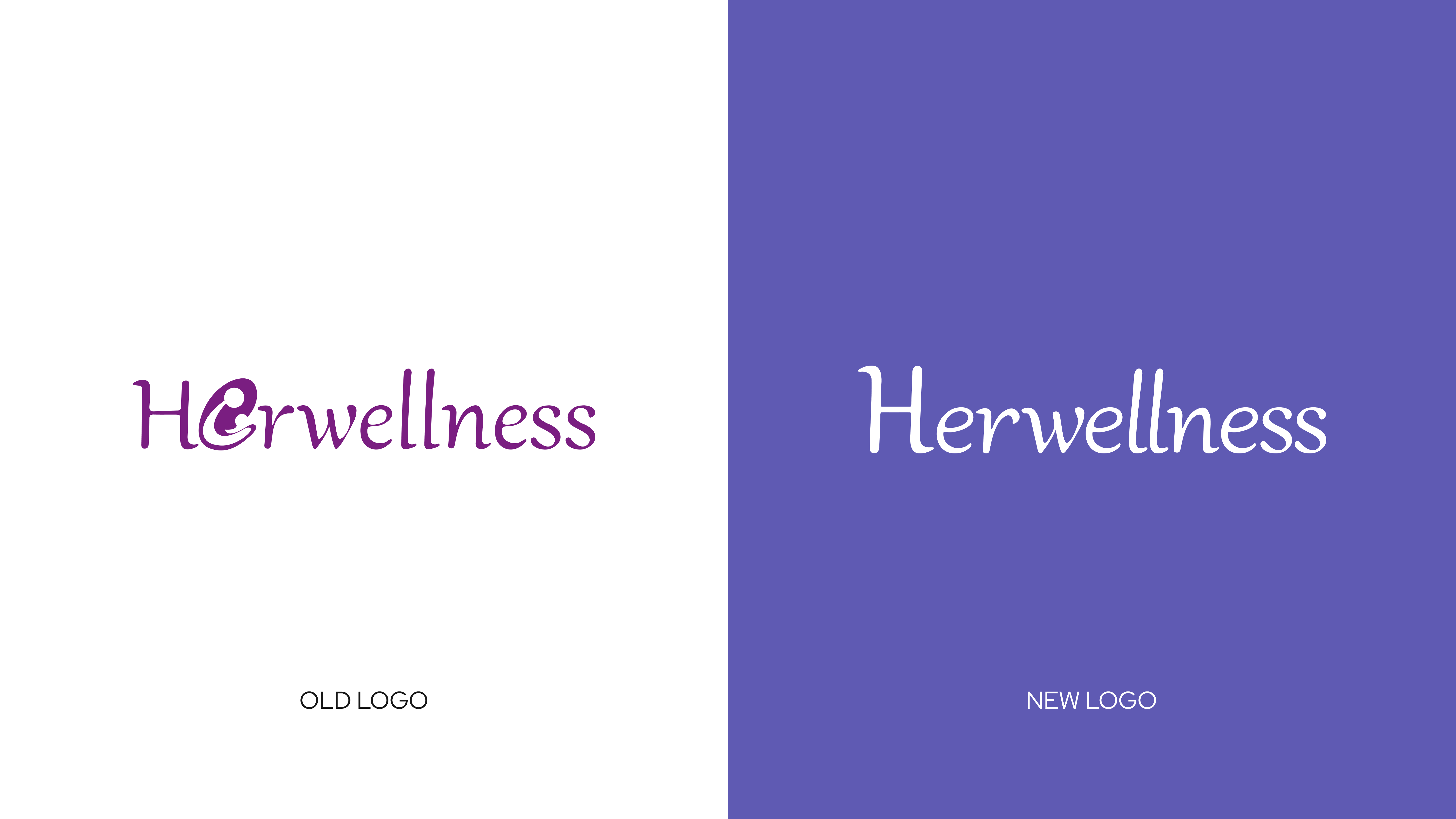
- Rebranding & Logo Augmentation
Our Learning
This project reinforced how delicate the balance can be between providing comprehensive information and overwhelming the audience. It also highlighted the importance of distinguishing a founder’s personal perspective from the voice of the brand itself. Ensuring that communication remained informative yet accessible, and personal yet representative of the larger organisation, required thoughtful restraint. The experience underscored that clarity is not about saying more, but about saying what truly serves the audience and the brand.
Measurable
Business Impact
Increase in Engagement
Clear visual language and consistent content structure made posts easier to understand, interact with, and share.
Increase in Engagement
Clear visual language and consistent content structure made posts easier to understand, interact with, and share.
Increase in Branded Search & Profile Visits
Stronger brand cues and more purposeful content direction encouraged more users to explore beyond the feed.
Improvement in Content Save & Share Rate
More useful, better-structured content made posts feel worth returning to and passing along.